
Joann Fabrics

Joann Fabrics: Empathizing, Defining, Ideating, Prototyping
VISIT LAUNCHED WEBSITE
Brief:
I and a group of amazing people that I worked with were tasked with re-design the main website of Joann Fabrics, the largest fabrics store in the United States. The focus of the redesign was to clean up the complexity of the current website, providing customers with a seamless experience for purchasing products, and joining classes.
Role: UX Designer
Empathizing x Defining:
The Problem:
The current website needed a massive overhaul in order to make it easier for customers to make online orders and purchases.
Design goals we set:
Increase online conversion / BOPIS conversion
Ensure the website focuses on mission & vision
Align the user's experience with user personas
Create a cohesive and unified site across all offerings - products, projects, classes & digital channels
Create a state-of-the-art mobile-first experience
Inspire customers, inspire delight!
Do the right thing for JOANN online & offline
Create a better customer experience
Be better than Michaels
Be a combo of Ulta & Sephora - combine education & inspiration
Personalize the experience for a customer/improve registration
Manage content easily & efficiently
Who are we solving for?
We wanted to form a deeper understanding of our users' goals, needs, experiences, and behaviors (psychographics informed by demographics). Leveraging the provided information from Joann, plus performing stakeholder interviews and contextual inquiries, we narrowed down personas to simple ideas that could anchor us.
User Personas:
Personas are characters that are used to represent the different types of customers who interact with your brand. They help us better understand customer goals, tasks, feelings, influences, pain points, and topics of interest.
We broke them down into 3 key personas:
Creative Nurturer
Eager Student
Avid Creator
Customer Journeys:
Taking the time to dive in deeper into a problem gives you a more concrete solution. One such tool that really helped us was creating customer journey maps.
This was extremely helpful in identifying pinpoints in the users journey while using the site and designing to fix these issues as it was easier to identify them via empathizing with the user.

Aesthetic Preferences:
In order to have a collective understanding of visual preferences, we take a look at different websites and rate each on a scale of 1-10 while providing commentary along the way. Understanding the team’s aesthetic preferences helps us stay aligned on future designs and the overall design strategy.
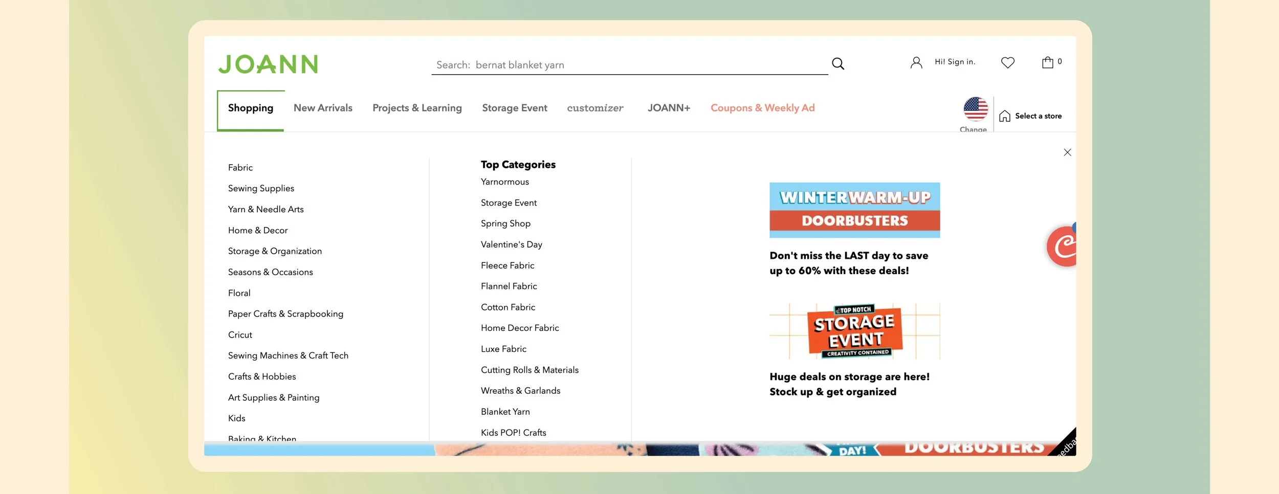
PROTOTYPING:
We created the site prototypes on Sketch, XD and InVision with Zeplin for UI element comments.
A Few of the Final Views
Let's address the elephant in the room. Designs are not always about what you like. Remember, you are not the user, and many times - you are not the business. It's about what is appropriate for the user and the business. We want to be proud of the work, and we have to compromise. That is okay. The designs below reflect reality. We had constraints, multiple perspectives, and guardrails. This isn't to say I hate the designs below. On the contrary. I am incredibly proud of how everyone navigated this challenge and what was shipped.

What did we learn?
Content is king. It can't be stated enough.
Outcomes, not features. As a team, it's easy to focus on features and not the root cause. Establishing the outcome early allows us to explore features that meet that need.

Showing Gratitude:
Gary Barth
Tova Raykin
Adam Stubbs
Eric Zirlinger
Keka Marzagao